
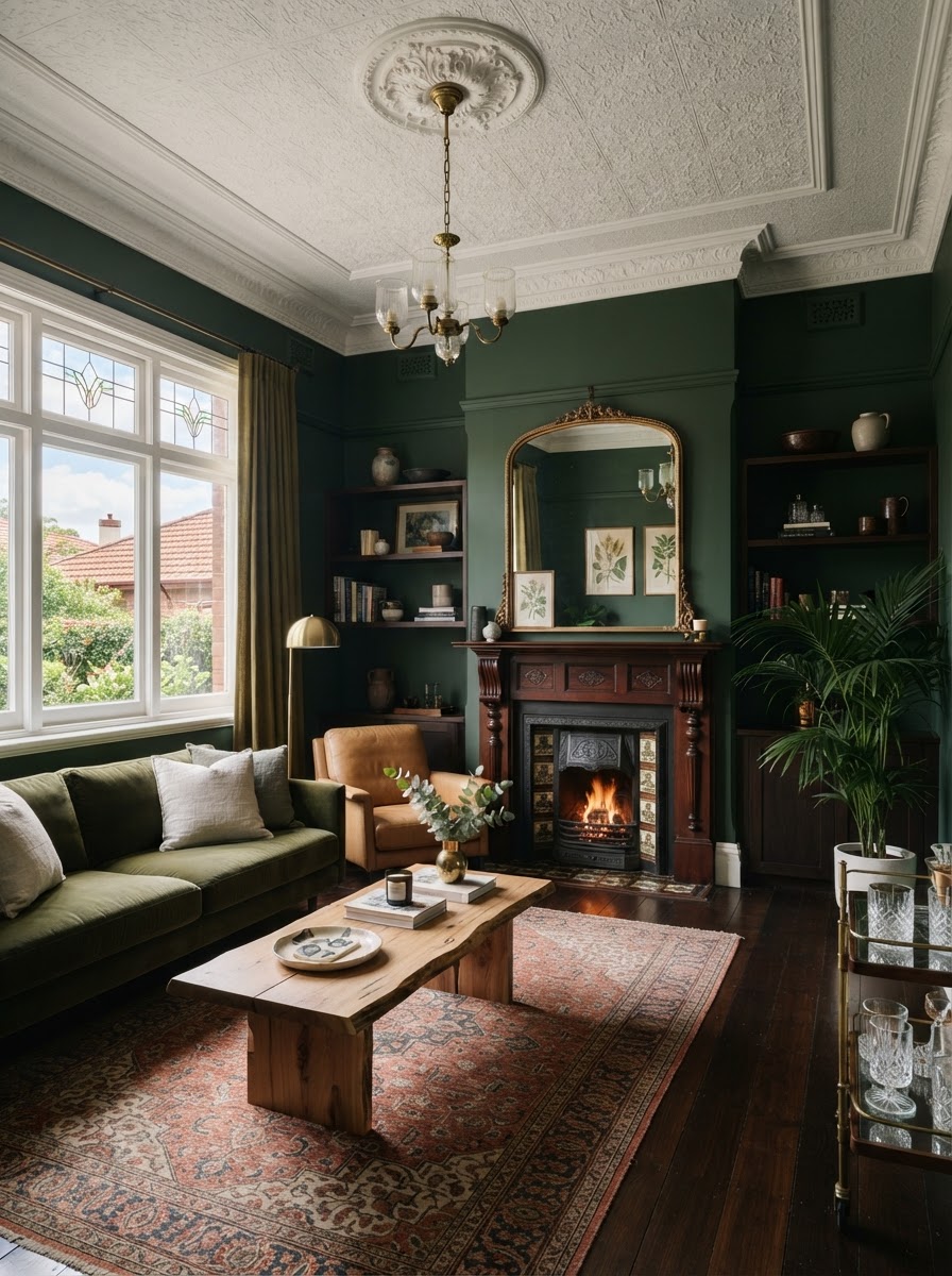
The best colours for a home follow its era, its materials and its light. Victorian and Federation homes suit rich, warm colours such as forest green, burgundy and cream, which echo the deep reds and greens used on period joinery [3]. Art Deco apartments, common in Bondi, Elizabeth Bay and Potts Point since the 1920s and 1930s [4], welcome jewel tones with brass and marble. Mid century homes suit earthy olive, mustard and walnut. Contemporary homes work best with warm neutrals and texture, and coastal homes with soft, natural colours rather than blue and white. Light matters as much as style: in Sydney, north facing rooms get the most sun [6], while south facing rooms receive cooler light that suits warmer, deeper colours [7].
- Victorian and Federation: forest green, burgundy, navy, warm cream, muted gold and terracotta
- Art Deco: emerald, dusty pink, midnight blue, champagne, ivory and black
- Mid century modern: olive, mustard, burnt orange, walnut, ochre and warm white
- Contemporary and minimalist: warm white, greige, taupe, soft charcoal, sand and muted sage
- Coastal: chalk white, sandy beige, soft sage, muted ocean blue, limestone and pale timber
- Light: test every colour on both a north and a south facing wall before committing [6][7]
Architecture tells the story of a home, but colour determines how that story feels.
Colour palettes by architectural style at a glance
| Style | Era | Signature features | Palette to start with |
|---|---|---|---|
| Victorian | About 1840 to 1900 [3]; Paddington terraces date from 1850 to 1890 [1] | Terraces, cornices, high ceilings, fireplaces, cast iron lace | Forest green, burgundy, navy, warm cream |
| Federation | About 1890 to 1915 [2] | Red brick, leadlight windows, decorative plaster and timber [2] | Warm cream, muted gold, terracotta, deep green |
| Art Deco | 1920s and 1930s interwar flats [4] | Curved lines, geometric motifs, coloured glass [4] | Emerald, dusty pink, midnight blue, champagne |
| Mid century modern | About 1945 to 1970 [3] | Open planning, natural timber, large glazing | Olive, mustard, burnt orange, walnut, warm white |
| Contemporary | Today | Clean lines, expansive glazing, open plan living | Warm white, greige, taupe, sand, muted sage |
| Coastal | Any era near the water | Natural light, views, indoor and outdoor living | Chalk white, sand, soft sage, limestone |
Era dates are approximate and vary between sources. Palettes are Bettini & Co starting points, not rules.
What colours suit Victorian and Federation homes?
Rich, warm and timeless colours. Victorian homes, built from about 1840 to 1900 [3], and Federation homes, built from about 1890 to 1915 [2], are known for decorative cornices, high ceilings, timber floors, fireplaces and leadlight. Paddington, with its Victorian terraces built between 1850 and 1890, is part of the first conservation area in Australia [1].
These homes suit forest green, burgundy, navy, warm cream, muted gold and earthy terracotta. The choice has history behind it: a NSW council heritage colour guide records that Victorian joinery and cast iron lace were commonly painted in dark reds and dark greens, against walls in buff, beige and biscuit tones [3].
Darker colours create intimacy in formal living and dining rooms, while warm neutrals let decorative ceilings, stained glass and original timber take centre stage. The secret is balance. A heritage home does not need to feel like a museum, and contemporary furniture and artwork can provide a wonderful contrast to traditional detail.
What colours work in an Art Deco apartment?
Confident colours and elegant contrasts. Art Deco apartments are a defining feature of Sydney's Eastern Suburbs, built in Bondi, Elizabeth Bay and Potts Point during the interwar building boom of the 1920s and 1930s [4]. The style is known for curved lines, geometric motifs, coloured glass and decorative detail [4].
It welcomes colour and personality: emerald green, dusty pink, midnight blue, champagne, ivory and black. Jewel tones suit the glamour of the era, while soft pinks and warm creams give a more contemporary reading. Brass, marble and velvet complete the look without overwhelming the original architecture. In an Art Deco apartment, colour should feel intentional, sophisticated and just a little adventurous.
What colours suit a mid century modern home?
Earthy colours inspired by nature. Mid century homes, broadly built between the end of the Second World War and about 1970 [3], embrace open spaces, natural materials and a strong connection between inside and out. A famous Sydney example, Harry Seidler's Rose Seidler House in Wahroonga, built in 1950, is a white concrete box that used colour blocking and broad panes of glass framing views of the surrounding bushland [5].
Olive green, mustard yellow, burnt orange, walnut brown, ochre and warm white work particularly well with timber, stone and textured fabrics. Rather than using every colour at once, start with a restrained neutral base and add one or two stronger accents. A walnut sideboard against a warm white wall, with an olive green armchair, captures the era without feeling dated.
What colours suit contemporary and minimalist homes?
Subtle, warm neutrals, with texture doing the work. Contemporary homes often feature expansive glazing, clean lines and open plan living. White has long dominated minimalist interiors, but warmer and more layered palettes now feel more inviting: warm white, greige, taupe, soft charcoal, sand and muted sage.
In these homes, texture becomes as important as colour. Natural stone, timber, linen, wool and plaster finishes add depth without clutter, and a subtle variation between walls, floors and furniture creates an interior that feels both sophisticated and welcoming.
What colours work in a coastal home besides blue and white?
Soft, natural colours drawn from the setting. Coastal homes across the Eastern Suburbs are shaped by natural light, water views and relaxed indoor and outdoor living, but they do not need predictable blue and white schemes. Chalk white, sandy beige, soft sage, muted ocean blue, limestone and pale timber let the light, the view and the proportions of the home take the lead. The most successful coastal interiors take their cue from the landscape rather than from beach themed decoration.
How does natural light change colour in a Sydney home?
More than most people expect. Because the sun sits to the north in Australia, north facing rooms receive sun for the longest part of the day in winter [6]. South facing rooms receive limited direct sun and generally cooler light, and Dulux recommends deeper, warmer palettes for them [7].
In practice, a warm cream that glows in a north facing living room can turn flat or grey in a south facing bedroom, and a crisp white can feel stark. Paint large samples on more than one wall and look at them in the morning, the afternoon and under your evening lighting before you decide.
Should architecture always dictate colour?
Not necessarily. Architecture is an excellent starting point, but the most interesting interiors often include an unexpected element. A contemporary artwork can transform a Federation living room. A bold burgundy feature can bring warmth to a minimalist home. A restrained neutral palette can give an Art Deco apartment a fresh perspective. The key is knowing which features deserve emphasis, and choosing colours that complement them rather than compete with them.
Do heritage homes have colour restrictions?
Sometimes, mainly for the outside. If your home is a listed heritage item or sits in a heritage conservation area, check with council before changing external colours or finishes. Woollahra Council explains that its local environmental plan sets out when consent is needed for work to heritage items, that a state planning policy sets out what work needs no consent, and that some minor or maintenance work can use a heritage works without consent application [8]. Interior repainting of an ordinary home is rarely restricted, but confirm with council if your property is individually listed.
How do you choose the right palette for your home?
- 1. Identify the era. Work out the style and the original features worth celebrating [1][2][4].
- 2. Read the light. Note which rooms face north and which face south [6][7].
- 3. Start with a neutral foundation. Choose a base that suits the architecture, then add one or two accents.
- 4. Consider the materials. Let timber, stone, brass or tile guide the undertones you choose.
- 5. Sample generously. Test large swatches on several walls at different times of day.
- 6. Check heritage controls. Confirm council requirements before any external colour changes [8].
Frequently asked questions
What colours suit a Federation home?
Rich, warm colours such as forest green, burgundy, navy, warm cream, muted gold and terracotta suit Federation homes, built from about 1890 to 1915 [2]. Warm neutrals help decorative ceilings, leadlight and timber stand out.
What are the best colours for an Art Deco apartment?
Emerald green, dusty pink, midnight blue, champagne, ivory and black, paired with brass, marble and velvet. Sydney's Art Deco apartments, found in Bondi, Elizabeth Bay and Potts Point, date from the 1920s and 1930s [4].
What colours work best in a south facing room in Australia?
Warmer, deeper colours. In Australia, south facing rooms receive limited direct sun and cooler light, so warm whites, creams and earthy tones usually work better than cool greys or stark whites [6][7].
Do I need council approval to change the colours of a heritage home?
Possibly, for external changes. If your home is a heritage item or in a heritage conservation area, check with your council first. Woollahra Council's local environmental plan sets out when consent is needed for work to heritage items [8].
What colours work in a coastal home besides blue and white?
Chalk white, sandy beige, soft sage, muted ocean blue, limestone and pale timber. Taking cues from the surrounding landscape usually works better than obvious beach themes.
The Bettini & Co view
A beautifully designed interior should feel connected to the architecture of the property while reflecting the individuality of the people who live there. Colour is one of the most powerful tools to achieve that balance. The goal is not to make every home look fashionable. It is to make every home feel considered, harmonious and unmistakably its own. That is why we approach colour as part of the broader design conversation, alongside architecture, proportion, natural light, furniture and personal style.
Architecture tells the story of a home, but colour determines how that story feels.
Talk to Bettini & Co about colour and interior design for your home.
About Bettini & Co
Bettini & Co is a boutique interior design and property preparation studio in Sydney, founded by Taylah Bettini. Its interior design arm creates permanent residential interiors for homeowners staying in their homes, alongside property styling, pre sale renovations and project management. The studio works across Sydney's Eastern Suburbs and Lower North Shore. Phone 0428 025 909 or email hello@bettiniandco.com [9].
Sources
[1] NSW Heritage (accessed 16 October 2026). "Paddington Urban Heritage Conservation Area." State Heritage Inventory. https://apps.environment.nsw.gov.au/dpcheritageapp/ViewHeritageItemDetails.aspx?ID=2421493
[2] Wikipedia (accessed 16 October 2026). "Federation architecture." https://en.wikipedia.org/wiki/Federation_architecture
[3] Goulburn Mulwaree Council (June 2024). "Residential Heritage Colour Guide." https://goulburn.nsw.gov.au/files/sharedassets/public/v/1/strategic-planning/cbd-studies/cbd-amp-surrounds-transformation-project/4.-residential-heritage-colour-guide-june-24.pdf
[4] Waverley Council (accessed 16 October 2026). "Art Deco flats," Celebrating Waverley. https://celebrating.waverley.nsw.gov.au/nodes/view/73260
[5] North Shore Lorikeet (13 June 2025). "75 years ago this Wahroonga house stunned the North Shore. Now it's re-opened to visitors." https://www.northshorelorikeet.com.au/p/seidler-wahroonga-house-re-opens-to-visitors
[6] Australian Government, YourHome (updated 2020). "Orientation." https://www.yourhome.gov.au/passive-design/orientation
[7] Dulux Australia (accessed 16 October 2026). "Maximise light in your home." https://dulux.com.au/projects/interior-projects/maximise-light-in-your-home
[8] Woollahra Municipal Council (accessed 16 October 2026). "Heritage and development." https://www.woollahra.nsw.gov.au/Building-and-development/Development-Rules/Heritage-Conservation/Heritage-and-development
[9] Bettini & Co (accessed 16 October 2026). "Sydney Property Preparation." https://bettiniandco.com/
All sources accessed 16 October 2026. Era dates are approximate. Colour palettes are design suggestions, and colours vary with paint brand, finish and lighting, so always test samples in your own home. This article is general information only and is not planning or heritage advice; check with your local council before changing a heritage listed property.
Choosing colours for your home?
Talk to Bettini & Co about an interior palette that suits your architecture, light and the way you live.
Book a Walkthrough